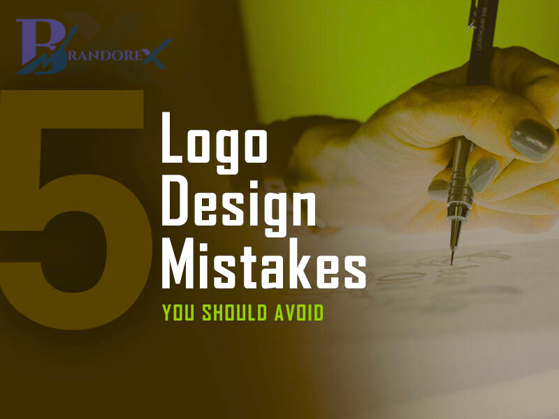
Your logo is often the first impression people get of your brand. A great logo is simple, memorable, and speaks volumes—without saying a word. But many businesses unknowingly fall into common logo design traps. Here are a few things to steer clear of:
• Too Much Detail
Overly complex logos can be hard to recognize and scale. Keep it simple and clean—less is more!
• Using Generic Icons
Avoid clip art or overly used symbols like globes, light bulbs, or random swooshes. Aim for originality that reflects your brand identity.
• Bad Font Choices
Fonts can make or break a logo. Stay away from overly decorative or hard-to-read fonts. Choose something timeless and versatile.
• Ignoring Versatility
Your logo should look good on a billboard and a business card. Always test it in black & white, on dark and light backgrounds, and in different sizes.
• Copying Trends
Trends fade, but your brand should last. Focus on creating a logo that stays relevant for years—not just one that’s “trendy” today.
• Lack of Meaning
Your logo should tell a story or represent something meaningful about your business—not just look “cool.”
Remember: A great logo isn’t just a design—it’s a strategic tool for brand recognition.
Need help with branding or logo design? Drop us a message—we’d love to bring your vision to life!
#Brandorex #LogoDesign #BrandingTips #GraphicDesign #SmallBusinessTips #BrandIdentity
Sima


Reviews
There are no reviews yet.